How to DIY a Product Launch Video with No Experience, and for Free
Update: I've now released Presenting, an app that helps make your launch videos more engaging and captivating.
Check out this demo video, which was made entirely using the app itself, without any post-processing or editing applied:
With launching WriteMapper 2, I wanted a snazzy video to help promote it. Despite having no prior experience, I set out to make one.
In keeping with the format of sharing DIY projects, here's the result first:
Not bad for a half day of work from a first-timer like me, right?
In this article, I'll be sharing the steps taken and tools used to create it, so you can do the same for your own product launches.
Study Precedents
As with any other instance of trying to do something for the first time, I looked for examples that I could learn from and emulate in trying to achieve the desired end product.
Things 3
Cultured Code launched their Apple Design Award winning app, Things 3 with this professionally made promo video. And it is such a thing of beauty!
The clip's clean and minimalist vibe is good news, as it's something that I can reasonably try to emulate in my own promo video.
We're probably not going to be able to reproduce certain elements in this video, however, such as how they made the devices pan, zoom and rotate while previewing their software.
Apollo
The best Reddit client for iOS, the Apollo app launched with a pretty good product video, which you can view on their website as well.
The way screen recordings are played back for preview is much more straightforward to replicate, and more doable for an amateur to capture and create.
Otherwise, this clip also uses a clean and simple aesthetic, and gives us more clues in how we can adopt this style in ours as well.
Start Identifying Patterns
Of these examples, we're trying to look out for patterns which we can use and replicate in our own video. For starters, both examples have a pretty similar sequence, looking something like this:
- Intro
- Main feature demos
- Sub-feature demos
- List of more features
- Outro
This gives us clues as to how we should arrange the content in our own video. We now also know we're looking to make a video that lasts for a minute plus, and the breakdown of timings for each segment in the sequence will also help us in arranging our storyboard later on.
We'll dig into how to use these precedents for our own video soon. For now, let's briefly cover the tools you'll need to get this video made.
Tools
I used free software that came bundled with macOS, so the good news is you don't need to shell out extra for specialized programs that'll let you make videos or edit them.
The bad news is, I don't know of the equivalents of these for Windows, so all I can simply say for this article is you'll need a macOS device to follow along.
QuickTime
To provide previews of our software, we need to be able to capture the behavior of it in order to play it back to the user. This is where QuickTime comes in super handy.
Keynote
This will be used to form the base of our video, from which we can style and animate elements in a medium many of us are already familiar with — the good old slideshow.
iMovie
The time we'll be spending in iMovie will be short, but crucial: it'll help us add sound as well as make edits to our clip to give it its final polish.
Resources
You'll also need a couple of other elements to create a complete video. Here's some resources I found helpful in helping with that.
YouTube Audio Library
Every video needs an accompanying audio track, and one that fits the video well at that.
YouTube's Audio Library seemed to be the most straightforward and easily accessible tool to use for this, according to some quick research I conducted (a.k.a. 1 x DuckDuckGo search).
The music tracks on there are conveniently filterable by genre and mood, so it's easier to pinpoint one for your video. It's also great that you know copyright issues have been taken care of, and the tracks that need attribution for use are also clearly labelled.
Of course, you'll still need to listen to the music itself to get a feel for it and know if it'll gel well with your visual content. I found that the best way for myself to do this was simply playing as many tracks as possible within the genre/mood of interest, and listening to each one for at least 30 seconds or so, and more if I liked it.
With that, you should be able to pick a track that you like enough to use in your video. Also, be sure that its duration is long enough to span the length of your video!
Fonts, Graphics & Colors
You also want to make use of custom styles where applicable, in order to have the video come across as distinctly your brand, instead of as a generic slideshow.
For example, the blue background for the sub-features in my WriteMapper video isn't a solid color, but rather a subtle gradient of two different hues of blue taken from the same gradient used in the WriteMapper product itself.
You can of course take this concept further for your own videos, changing more things like the font used to customize the overall feel of the video you're creating.
The Steps
Now, we can finally get to the actual steps in creating the product launch video!
1. Lay Out Your Video's Storyboard
We get started with determining the structure of our video clip. From studying the ones from Things 3 and Apollo, we roughly know how we're going to do this; what's left is to add in specific details of how each of these is going to look:
i. Intro
Keep things simple with the intro, showing your app's name and logo on the first segment, followed by its one-liner description or tagline. The intro should be a total of about 5 seconds long.
ii. Main feature demos
For the main feature demos, we're going to need 2 to 3 of them, and each one featuring a demo clip about 9 to 20 seconds long.
iii. Sub-feature demos
And for these demos, each preview clip should last about 1 to 3 seconds long, arranged ideally from demos with the longest duration first, and ending with the snappiest demos.
iv. List of more features
And for all the title headings that are flashed before the actual video previews, those last about 1 second long per title — about half a second for the quick-fire ones that appear towards the end of the video. There should be a list of about 5 to 10 features in this segment of the video.
v. Outro
Keeping things simple like in the intro, finish with showing the app's logo and name again, this time supplementing with an extra information you'd like the viewer to know about your app, such as the platforms your app is going to be available on. The duration of the outro can be anywhere from 5 to 15 seconds, depending on how much information you're including in it and how you're syncing it to the closing music — which we'll address later on.
From here, what's left is deciding what are the features or benefits of your product that you want to show the user in each segment of the video. Only you can decide this for yourself and you know your product the best.
Overall, this structure should leave us with a video that will run for around 60+ seconds to a maximum of 90 seconds.
Take all this information down on a note somewhere and we can move on to the next step.
2. Capture Necessary Video Content
Now that we know what are the pieces of demo content we need for our video, we can go ahead and capture these one by one.
This is where QuickTime comes in. With QuickTime, you're able to capture screen recordings on any Mac or iOS device. Here's an easy-to-follow link on how to record your screen on a Mac with QuickTime.
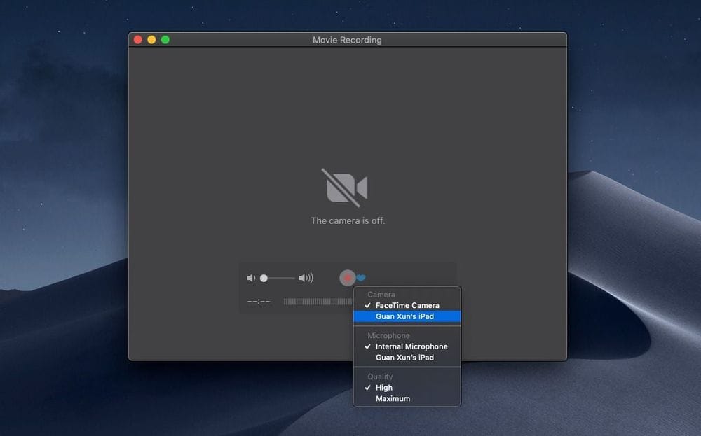
To record the screen of an iOS device with QuickTime, first connect the device to your Mac, then select "File > New Movie Recording" from the menu bar, and click the dropdown icon next to the record button, which should reveal your connected device as one of the options available under the "Camera" section:

For iOS-specific websites or apps, while iOS devices now ship with the screen recording function, it leaves a big red "screen is currently being recorded" icon in the recorded video, so that can be distracting when presented to a viewer and not entirely representative of how your app or software is supposed to function.
QuickTime also sets the status bar information like battery level and time to generic values while doing a screen recording, so that's another nice advantage of using it.
Another thing to note here if you're recording only a part of your screen, is not to record too small of an area as this might cause pixellation issues later on when you stretch out the screen in Keynote.
Once you've gotten all the video clips you need, you're all done with this step!
3. Create Keynote Presentation
Keynote is where the majority of our video will be created. With the help of the software's timed animation capabilities, we can magically turn this into a moving picture!
Update Nov 2022: Keynote was an old workaround I used to use. I now have an app called Presenting which I use to put together a compelling, engaging end product for better results.
a. Build Structure
First off, create a new project in Keynote. Referring to the storyboard that you've laid out for the video, add slides with titles of each of the features you want to include in the video, as well as the content of the intro and outro.
This would also be a great time to add any graphics, fonts or styles you intend to include, such as your software's icon or logo. Be sure to position all elements as you would like them to appear in the final video, which is likely centered in the middle of the screen.
It sure feels like we're making some progress! Now let's move on to the next part: adding the videos to this slideshow.
b. Insert Video Content
Once that's been taken care of, we can move on to adding the slides that will play the actual video demos which were just captured. For this, there's three things you want to take note of:
i. Positioning & Framing
Depending on the dimensions of your captured demo clips, you might need to resize them after inserting into Keynote. After resizing, position the video object in the center of the slide and place a frame around it using Keynote's shape tool.
ii. Trim Length
You might have gotten more than you need when capturing the demos — there's a handy trim function in within Keynote that can help with this. You can find it by selecting the movie object, and then accessing the Format > Movie option panel found in the top-right of the Keynote window. From there, simply drag the handles of the Trim section's slider to remove the loose ends of your video clips.
iii. Uncheck "Start movie on click"
Lastly, you also want to uncheck said checkbox (found in the same pane as the trim options) so that the movie automatically plays when the slide is entered, enabling our video of a slideshow to proceed smoothly.
Repeat each of these as necessary for all of your videos in the slideshow. Don't worry if your video clips currently aren't exactly as you'd like them: we can make further edits later on in iMovie.
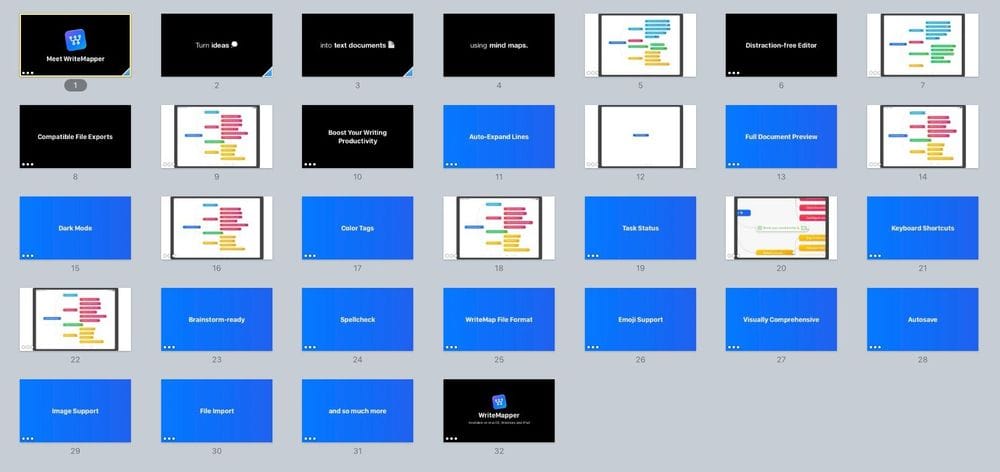
All in all, this is what my slideshow looked like when I was done:

Now, for (what I think is the) the fun part: animations!
c. Animate
This is where the magic happens — where a slideshow gets turned into a living, breathing self-playing sequence! I've split this section up into these couple of parts:
i. Object Animations
It's kind of the point of a video to have things move instead of still frames. Here, we can take advantage of Keynote's animation capabilities to do things like animating in the titles of each of our features. A key point to note here is to configure the build order in each slide such that the animations play out automatically, and in your desired cadence. From the Build Order window, make use of the "Start" and "Delay" settings options to have this work as intended.
ii. Slide Transitions
Besides animating objects in our slides, we also want each slide to move on to the next one automatically. To enable this, select the slide in the navigator on the left, and then click on the Animate pane in the top-right. From there, set the "Start Transition" value to "Automatically". You can also add a transition effect here, if you wish.
iii. Video Clip Durations
One thing you might notice after having put transitions between slides in place is videos getting cut off before they're done playing. To remedy this, set the automatic transition delay to a duration similar to the length of the video clip on that same slide.
With all your animations in place, you should be able to hit the "Play" button in Keynote, and have the slideshow play smoothly from start to finish. Go back and add in the missing transitions or animations if this isn't the case.
You can also take this opportunity to review the cadence of the sequences in the animations, and make any necessary edits. Once you're happy with the result, we can start moving out of Keynote, by turning this whole slideshow into an actual video file.
4. Convert Keynote Presentation to Video
If you look in the Keynote menu bar options, under "File > Export To", you'll notice there's a "Movie..." option which seems convenient for our current objective: to get the slideshow turned into a video file so we can edit and share it.
However, that's not what we're going to be using — videos created using this export option are always of low quality, suffering from low framerate and resolution, making for a below-par viewing experience.
Here, we can once again put QuickTime's screen recording function to use. Start the screen recording before hitting the Play button in Keynote, and capture the entirety of your slideshow in fullscreen mode. It's okay to have extra unwanted frames at the beginning and end of the screen recording at this stage as we can edit those out later on in iMovie.
There we have it! A movie file to work with.
5. Add Sound in iMovie
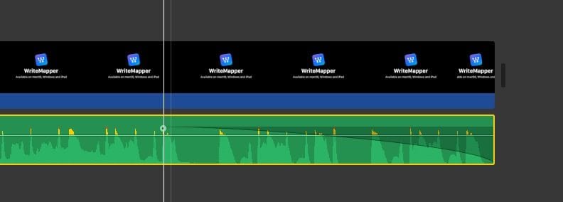
The main thing we want to do in iMovie is adding sound to our currently silent movie file. Bust out the audio clip you selected earlier, and drag it into the project in iMovie, making sure it lines up with the start of the movie clip.
If you don't want the music abruptly cutting off towards the end of the video, you can set the sound to fade out towards the end by simply dragging a handle on the audio clip:

We're almost done — just some more quick edits to go in the next step.
6. Apply Finishing Touches
Besides audio, however, you can also spend some time in iMovie making edits to the video clip. If a segment of it happens to feel too slow, speed that segment of the clip up by adjusting its speed or splicing out unwanted sections of it. You can also add freeze frames to the video which prolongs the duration a certain frame in the video is displayed.
Play the edited video to assess if further edits are required on top of the ones you've already made. Once you're happy with what you're looking at, great news: you're all done!
“And there you have it: your own product launch video!”
Now all we need to do is export the edited video file out from iMovie, by hitting the button with the share icon in the top-right of the window, which will allow you to set export options for the video file. Wait a couple of minutes for that to process, and there you have it: your app's very own promo video!
Now you get to play it back a couple of times for yourself and people around you and feel a slight sense of accomplishment. :)
Conclusion
And there you have it: your own product launch video ready to be shared with the world!
To be fair, I'm sure professional video producers will be able find a million things wrong with the end product, but I think it's still pretty good given it's the result of a one-person, half-day effort. More importantly, it's able to fulfill its function of being a short and snappy showcase of your product to new customers who have never used or even seen it before.
This article was written with WriteMapper, a writing app available on macOS and Windows, which uses mind map outlines to help you get from idea to final draft in no time.
Thanks for reading, and I hope you've found this sharing helpful! Subscribe using the form below if you'd like to be notified when new posts are published.